





THE CHALLENGE
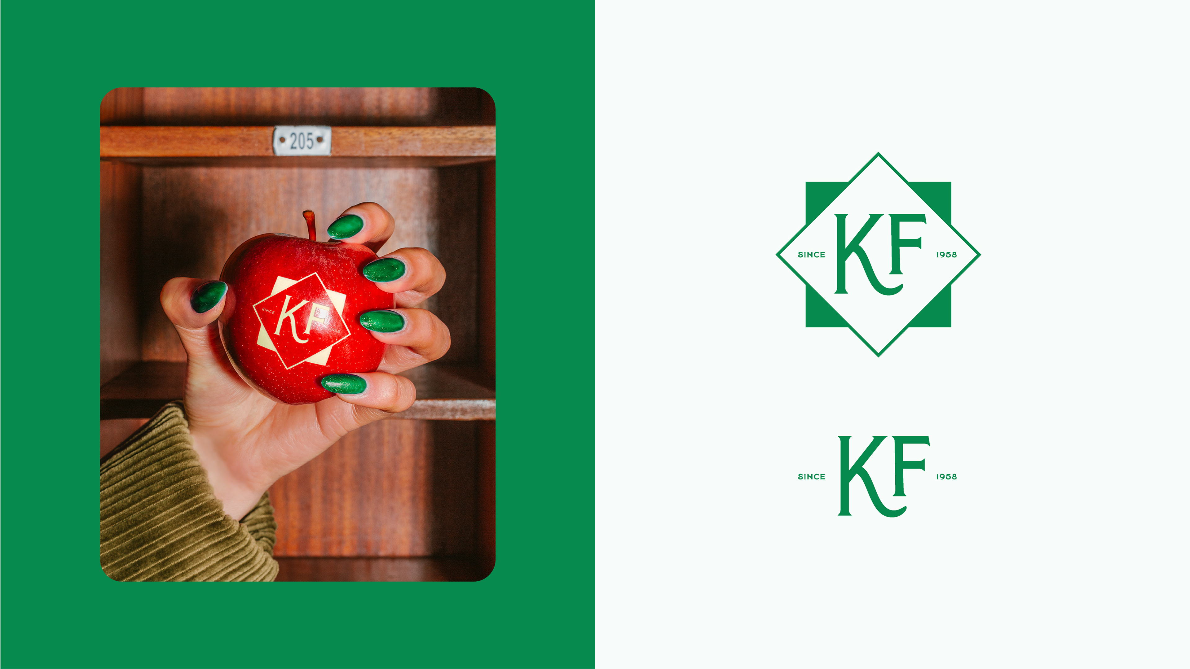
Koyuncu Farm is a food brand that carries its farming heritage forward through a contemporary approach to production rooted in harmony with nature. The brand needed a new identity that could reflect its respect for the land, craftsmanship, and product purity, while expressing its traditional production culture in a simpler, fresher, and more distinctive way.
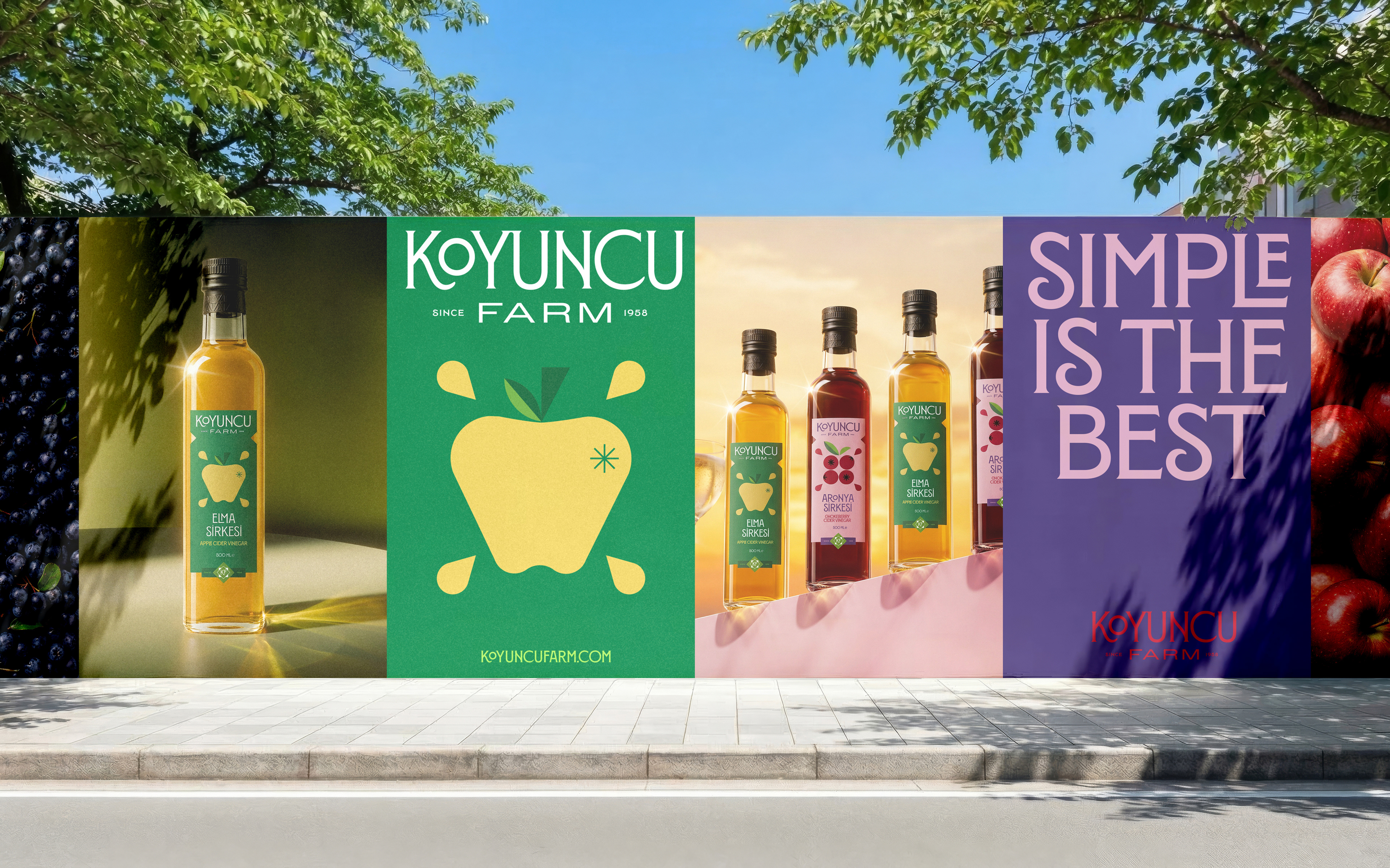
The goal was to create a cohesive brand system that highlighted the natural quality of its vinegar range, stood out clearly on shelf, adapted across different products, and consistently expressed Koyuncu Farm’s core belief: “Simple is the best.”
THE SOLUTION
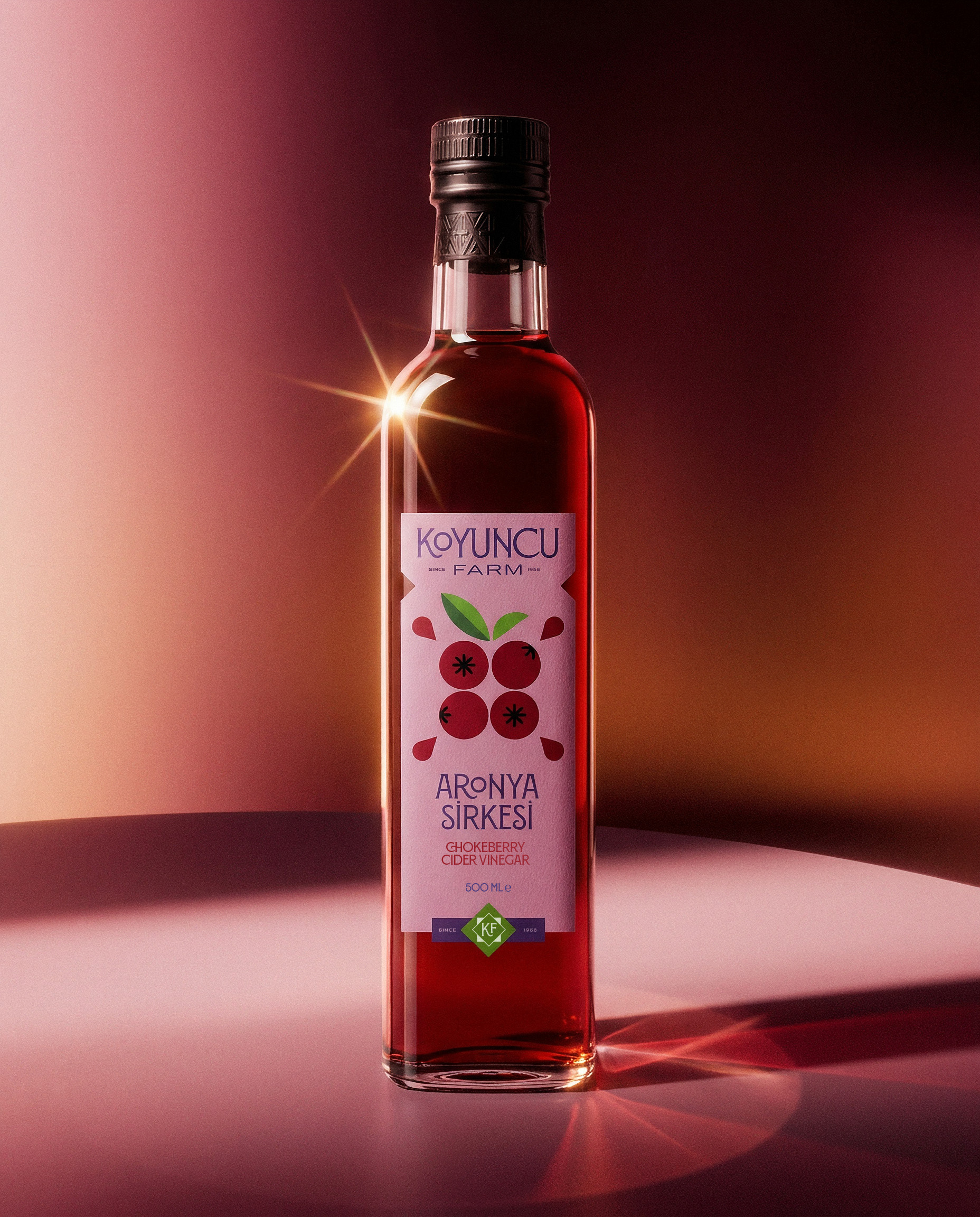
We turned Koyuncu Farm’s “Simple is the best” motto into a direct design principle. A stripped-back visual structure was combined with vibrant colors, clear typography, and straightforward product communication.
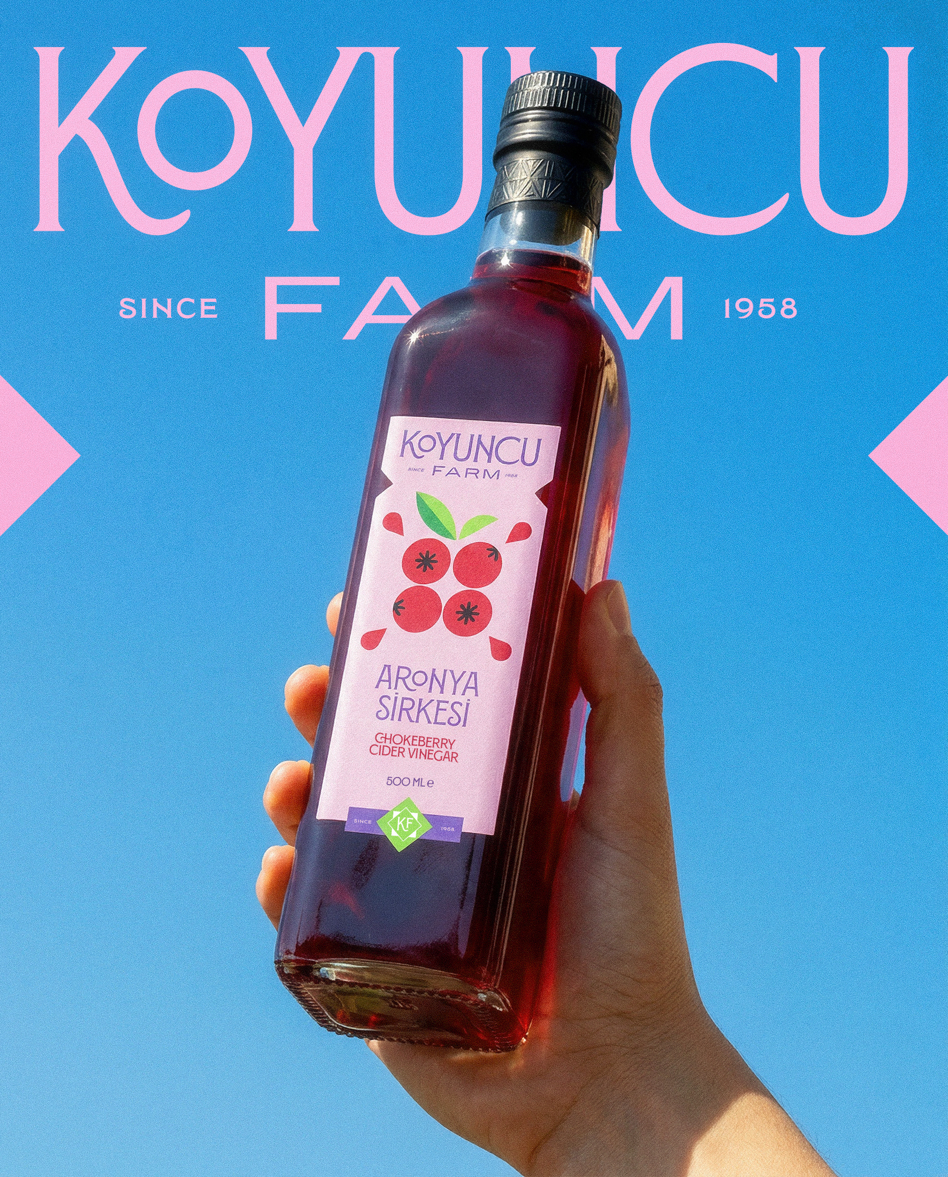
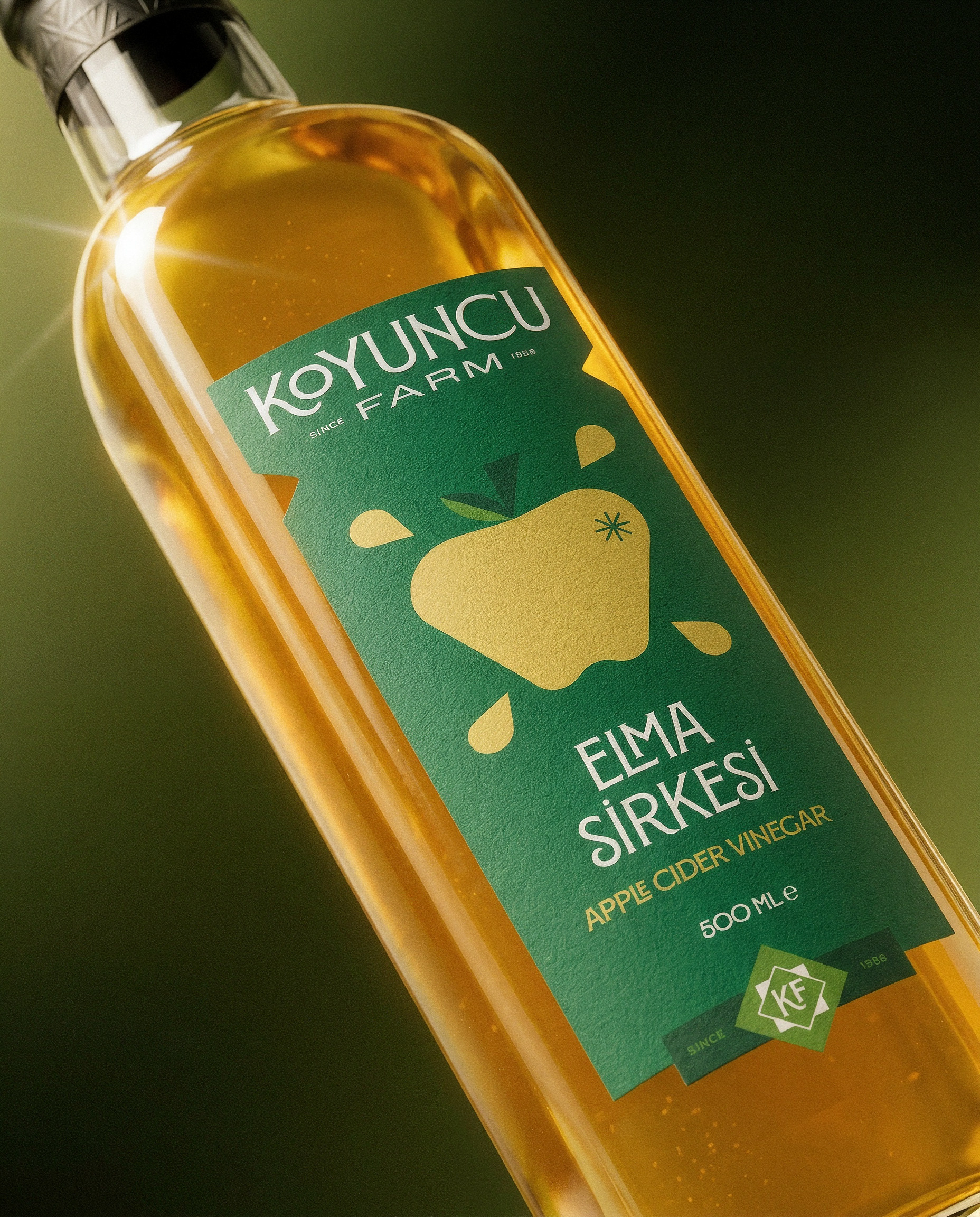
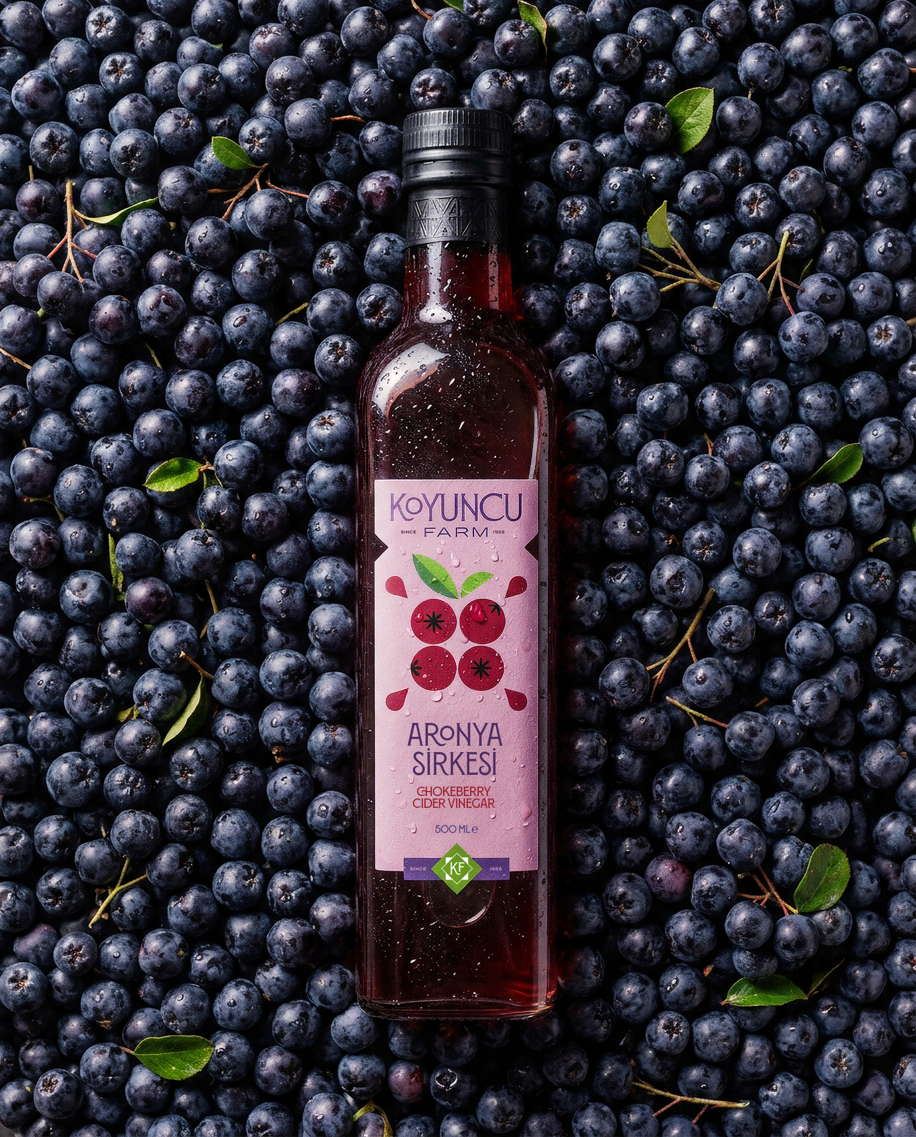
Bold color coding gave each product its own character while allowing the range to remain instantly recognizable as one family on shelf. The identity system followed the same logic, creating a consistent visual language across the logo, typography, color palette, and packaging.
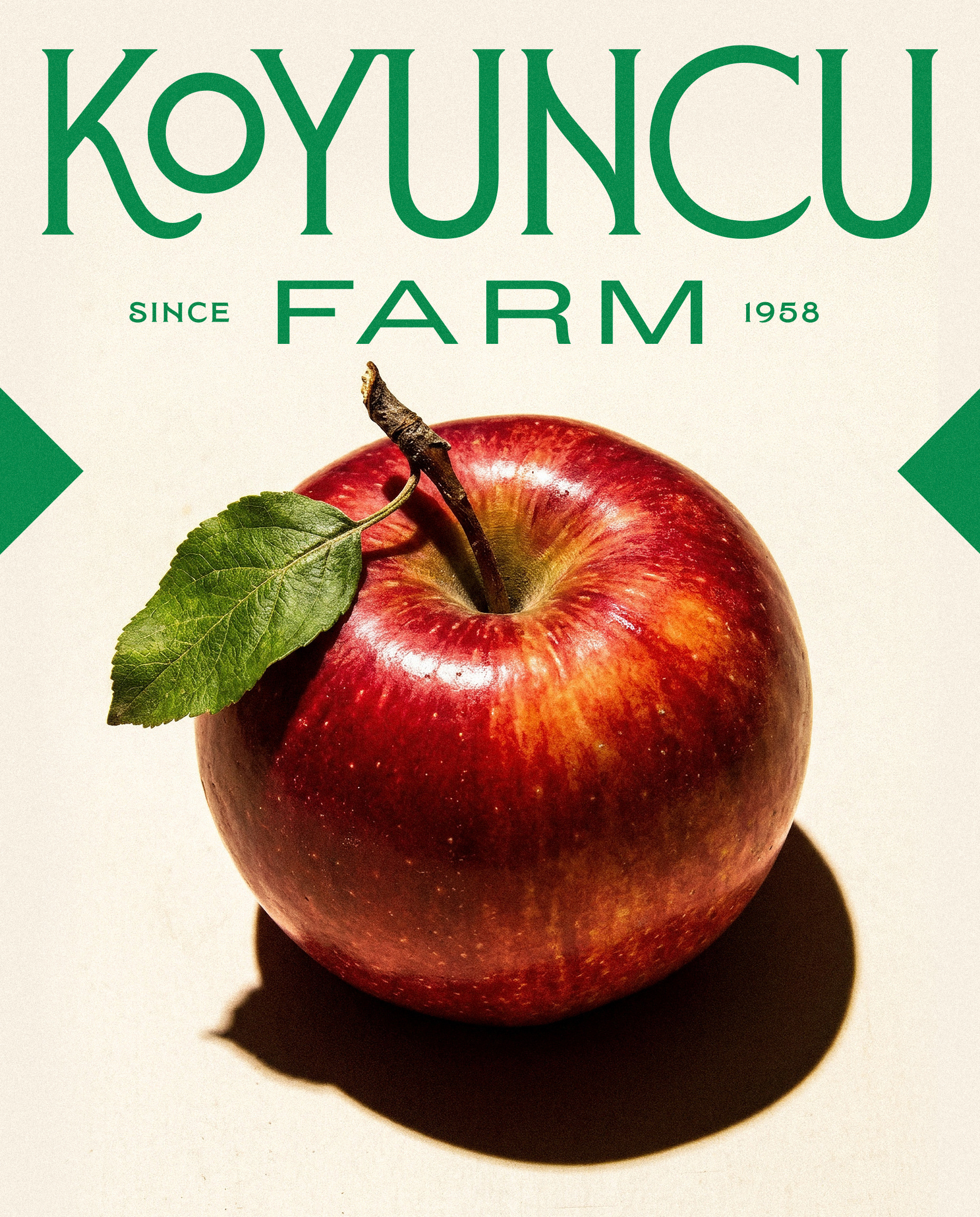
The result is a brand world that expresses Koyuncu Farm’s natural character without relying on nostalgic farming clichés pure, vibrant, contemporary, and direct. The product is simple and honest, and the design follows the same principle: Simple is the best.
CLIENT: KOYUNCU FARM
DESIGN STUDIO: GARİP STUDIO
DESIGN & CREATIVE DIRECTION: BERTUĞ BİLGİN
COPYWRITING & PROJECT MANAGEMENT: EDİZ AKATLAR
TYPEFACE: TIPOFILI / MONTECATINI PRO
Garip Studio© - garipstudio.com / Bertuğ Bilgin© - bertugbilgin.com - 2026